In working on my project there was a good amount of work that went in behind the scenes. Here I take you through the process that resulted in the data visualization and timelines of the student protests from 1965-1975 and 2005-2015.
Deciding depth vs breadth
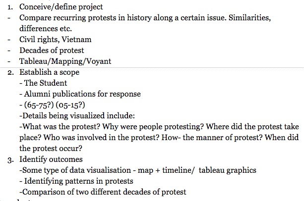 I was initially indecisive about the approach that I would take in the project. I was battling between going in-depth and making a comparison between recurring protests in history along a certain issue, or more broadly taking more of a surface level approach and stretching the research to cover somewhat long periods of time. I eventually settled on focusing on breadth over depth. This decision was ultimately made by my choice to use tableau as my primary tool. The ability of tableau to generate meaningful insights in a clear way from large datasets eventually led me to focus on breadth over depth.
More information on how I chose my data sources and the years of focus can be found on the project summary page..
Understanding history
With an extremely limited knowledge of American history and having scoped out a few issues of the student from the 60’s, i realized that I needed to broaden my understanding of American and world politics so that nothing important flew over my head. I started with reading up on American history and college culture of the 60’s and 70’s in order to be able to contextualize the era before I started collecting my data. I didn’t have a lot of time on my hands so I used google as my resource, and found concise summaries to help familiarize me with the time.
Understanding Tableau’s Mapping feature
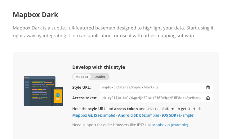 used tableau very minimally it was important to me to learn how to map with the tool, so that I could learn how to collect the data specifically for the features of tableau that I wanted to explore. Since Tableau’s map feature is limiting in that it does not have a street level view, I had to open an account with Mapbox, which is a map server compatible with tableau in order to develop and use a style of a map that would enable street view. I ended up deciding on the Mapbox Dark style, of which I had to input the access token into tableau for it to be applied.
Data collection
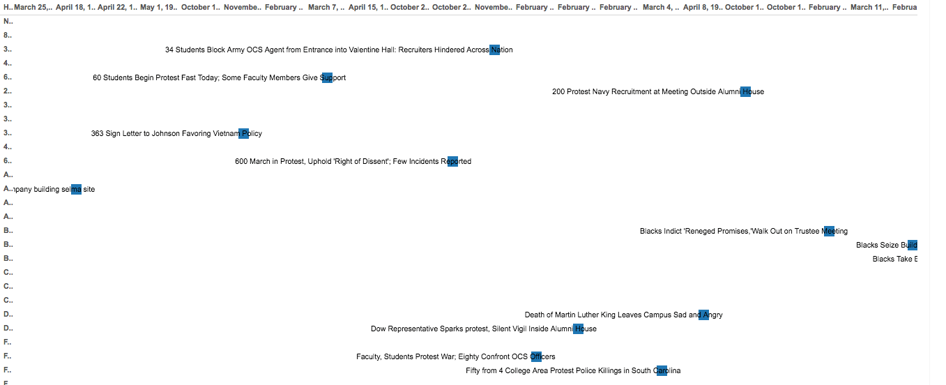
My initial plan was to use Voyant to upload the Newspaper OCR of the years I needed, then look up the words; protest, rally, demonstration, petition, strike. By capitalizing on voyant’s ability to show how frequently a word is used in a document and which part of the text my reasoning was that I would be able to track the issues which had articles about protests in them and get the information I needed. But we don’t always get what we want, do we? Turns out that concatenating the OCR of the Amherst Student led to one large file which was not able to be divided according to issue.
I therefore had to abandon that and go old school, flipping through each issue of the Student paying attention to the headlines of the articles, as well as quickly skimming through the text while collecting as much information about each protest as possible. In the middle of my data collection, I took a much needed break from the archives and tested out the first set of data on tableau to see if my vision would actually work to generate a map sample.
This took a week and a half to complete.
Data clean up
This proved to be a hectic part of the process. First of all I had to manually input longitudes and latitudes of different locations into the spreadsheet. Only after this was completed did I notice that protests that happened at the same location were stacked as one measure and there wasn’t a remedy for this. Therefore I had to individually select different points within the same building/ location and input the coordinates for those in order for them to be presented as separate events on the map. It was time consuming but proved worthwhile. I also had to come up with methods of classifying the protests so that it could make it easy to play around with different datasets.
My final dataset can be viewed here.
Building the visualization
While I was 100% committed to using only tableau for every single aspect of my presentation, the timeline feature did not prove useful and was a pain to navigate. I therefore resorted to using TimelineJS to build the protest timelines.
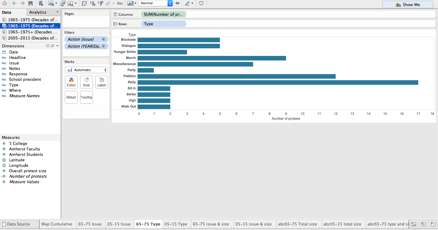 Working in tableau was confusing but very fun. I had to open countless worksheets, testing different graphs and visualizations, deciding which filters would work and which wouldn’t. Most of my time in the end was spent figuring out how to tie it all together into one.
After consulting numerous help forums I was finally able to accomplish what was my initial goal. You can find all the mini worksheets that led up to the final visualization below. This part took about a week (including some after work hours).
‘Rough work’
Decades of Protest | The Process | Sources